A Practical Framework for Consistent and Flexible Content Creation
Introduction to the Design System
A Unified and Flexible Design Approach
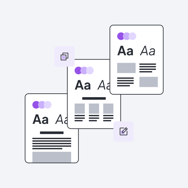
Our design system ensures consistency and ease of use across all pages. It offers flexible layouts and components that work seamlessly together, making it easy for content creators to build and manage pages. Whether you're adding new content or updating existing pages, the system keeps everything aligned and simple to work with.


Design Components
Modular Elements That Work in Harmony
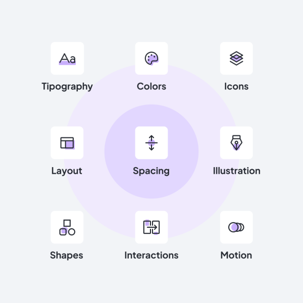
Modulo’s design system includes foundational elements such as typography, a carefully curated color palette, buttons, and form components — all the way to more complex components like card views. The entire system is built so that these various building blocks work seamlessly together and remain visually and functionally consistent across different use cases and compositions. This ensures a coherent and enjoyable user experience throughout.
Layout & Grid
Flexible Layouts for Any Page
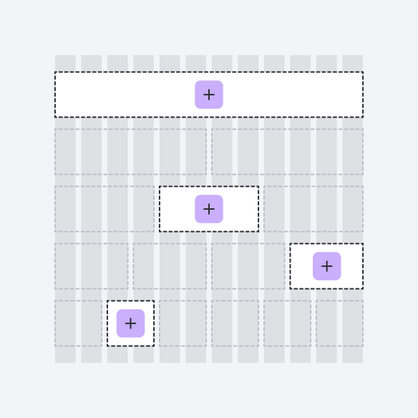
Modulo’s grid system gives you the freedom to create layouts with one column, two columns, or more. The columns can be evenly spaced or have different widths, depending on the content. This system ensures everything is aligned and looks organized, while automatically adjusting to fit different screen sizes, from desktops to mobile devices.


Modular Structure
Content Elements Aligned with the Design System
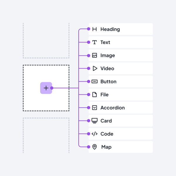
The content management system uses modular "paragraph types" — such as text blocks, images, buttons, or more complex components like web forms and content listings. All components are responsive, meaning they automatically adapt to different screen sizes.
These elements are closely aligned with the principles of the design system, ensuring that content presentation remains consistent with the visual and structural layout of the site at all times.
Core Principles
Guiding Values for a Better User Experience
Curious How to Structure Your Content?
Explore the building blocks at your disposal — including text, images, videos, expandable sections, content highlights, and web forms.